Monday, January 10, 2011

Biotech Tower - Fall 2010 Project Summary

Battleship

Last term, we broke into groups to create projects for this year's eVolo competition. eVolo is a high-rise idea competition. I say it's an idea competition because it's not the sort of thing that requires "complete" design. There doesn't have to be structural diagrams if structure isn't part of the point you're trying to make.

The program was to include a massive bioengineering institution, seeing as this is one of the leading industries of the city. To represent this, we toyed with the idea of DNA, playing with spiraling forms. We decided, however, that this has been done before and wanted something new. Our site was located in San Diego at the water's edge. There is a shipyard nearby, and a U.S. naval base as well. Therefore, the shape of a battleship became the basic design module. Three ships stood on end create a core for the building; twin cores retain our idea of symbolic DNA.

Twin Cores

The opaque cores were to house such things as restrooms, vertical circulation, store rooms, etc. The main program as far as the users are concerned were to reside in the transparent area between the cores. This creates a degree of separation which allows control over entrance to the more sensitive lab areas. We derived the dimensions of the resulting linear floor plan from sun angles; direct sunlight would reach every square foot between the cores.
First Concept of Tower Form

We later decided to make the cores transparent as well, taking advantage of the views these areas offer by placing administrative offices and break rooms at the exterior. The form changed when we discussed wind power. Turbines located about two thirds up the building power most of the building's energy needs because the form of the building is made to funnel air into them. (Wind speed doubled will increase windmill power output by eight times the original output.) Ship curves are aerodynamic, pushing water out of the way to make for easier passage. We utilized this concept, adding curves to the building to push air into turbines that would otherwise have hit the building face only to be moved around the sides.

Wind Diagram

We oriented the building on the site with wind power in mind. The wind-collecting side of the building squarely faces the dominant wind force coming in off the ocean.

In order to control the extensive sun exposure caused by the extensive glass surface of this structure, we created a deep diagrid overlay. The depth of each point was calculated to allow direct sunlight in the depths of winter, while keeping complete shade at the height of summer. We also added internal controls such as curtains and blinds for individual control of light and heat.

Diagrid Facade with Winter Shadows

Labs are often very sensitive to light, so cubicles take advantage of views and the most direct light. Lab walls are offset from the exterior, made with transparent materials and supplied with internal controls in the form of blackout curtains.

Example Floor Plan

We did a lot more work on this project than we were able to present in our competition boards. We developed a very useful program and laid it out, along with an intricate elevator scheme, in such a way as to make sense with the building height and floor types. For example, look at where the wind passes through the building in the above diagram. The cores, of course, are not broken here even though the main floor is missing. We chose these stories to house the archives (material storage, reference libraries, etc). This allows each floor to have a separate topic and to be controlled separately.

The bottom floors have many public functions, including educational museums (such as a sustainability museum), a daycare, and a craft center. Above them are conference and lecture rooms, for use by employees or for public scientific conventions. There is an on-site gymnasium that is open to the public. It, along with a performing arts center, are both underground to maximize the public park of the site. Extensive parking is located under manufacturing buildings which are also inspired by ship forms. These buildings, however, were left undeveloped as our focus was on the tower itself.

Biotech Park

Saturday, August 21, 2010

Italy Field Trip Finale

Sorry, my dear readers, but my pictures are not on my laptop yet so all you get is the story for now.

After the field trip for the final review, we went to Italy for a week. However, since our coursework was over, some people went to other places. Slowly, over the space of three or four days, we trickled down to three students, our teacher, and his family. By the time I got back I had lost touch with the group completely.

The first day we took a series of trains to Sienna, stopping in Firenze (aka Florence) on the way to check in to our various hostels. In Sienna we went to the piazza and saw the famous horse races, which are really a very long ceremony that ends with a horse race. Flag bearers and important religious figures paraded around the piazza for several hours before the race started. The piazza (pee-ah-tsah) is in the middle of the track, so once the ceremonies start you can't leave until they're over. The piazza is a large sloped expanse of stone pavers with no shade and no restrooms.

About two-thirds of the way through the marching flags, the girl sitting a few feet behind me tapped my shoulder and asked if I speak English. When I said I do, she pointed to my peer's towel and asked if it was mine. I said I knew the person it belonged to, and asked what she needed it for. She said she was going to be sick if she couldn't pee, and asked if I would hold it around her while she peed into a bottle. I did so, both of us laughing at the situation, and she had a small accident, so she bought the towel from my peer rather than washing it for him. Turns out she just finished her degree in the States, had been living in Sienna for two months, and began filling me in on the historical references that I was missing in the ceremony. We traded watercolor drawings, each of us signing our work and including an e-mail address. What a way to network!

The next two days were spent on Florence, where our instructor has lived twice in his life, where he met his wife, and where he proposed to her. The sentimental value he has for the place made his guidance even better there than in previous cities. Between that and being down to less than ten students, my stress levels were very much gone and I was thoroughly enjoying myself. I learned a lot at the same time.

Aside from the magnificent architecture, there was also magnificent shopping. Italy's prices are much cheaper than what we can get in Switzerland, and Florence had a really good street market going on. I got myself a leather-bound sketchbook from which the paper is removable so you can re-use the thing your whole life. The leather is green, and I got a calligraphy pen and green ink to match the leather. All of that together was less than what I paid for lunch at a mediocre restaurant in Switzerland today, and it was real leather.

After Florence was Cinque Terre, a wondrous collection of five cities along some very amazing coastline. We were supposed to go on the 9:50 train, so I got on the one before it in order to check in to my hostel and meet my group on time in Cinque Terre. However, the train before that left at 7:21, so I had a two-hour layover in Pisa instead of getting to Cinque Terre early. Two hours in Pisa when you were supposed to have 20 minutes... What would you do? I saw the leaning tower and the duomo it's associated with. It took 45 minutes to walk across town from the train station, so I didn't risk climbing it for fear of not making the train, but I still got to see it! No pictures though - I had taken the wrong power adapter with me to Italy and my camera battery died in Florence. I thought I was on the same train as the others to Cinque Terre, but I never ran into them. I saw the place by myself, but it was so beautiful it didn't matter. The water was clear enough to see to the bottom and looked blue and turquoise and green depending on the place.

After Cinque Terre I went back to Scudellate, where a handful of us were still left to leave for good. I packed up everything, and the next morning I got on the earliest bus out of Scudellate. I came straight to Lugano, put my baggage in a locker, and explored the town while I waited for check-in time to roll around. It's nice having a hotel instead of a hostel. Tomorrow I go to Germany!

Final Show Field Trip

The 14th of August was our final review, the time when every team presented their work to a jury (also called a panel) of reviewers. These included the two main clients, a very well-known architect in that region, our instructor, the two architects who have been working with our instructor, and a few other individuals of just as high standing. Most of us were highly intimidated. I got to go first.

I had four boards set up with most of my graphics, and gave my presentation with the slide show I posted earlier on this blog. One of the clients was grinning the whole time, the look of excitement spreading across his face with each new idea I presented. My project, as you might have gathered, was based on the idea of creating something which the clients can really use and afford, and will be able to install in a relatively short time frame. Most of my peers presented projects which were not build-able, required extreme measures for completion, and/or would be far too expensive for our client to construct. As such, mine was the favorite of the grinning client. Upon conclusion of feedback, he told me I had an "excellent project," which is not something I have ever been given as feedback at Cal Poly. I was designing for the client, and my design made the client grin, so I feel that I did well. I also agree with the other client's feedback about certain weak points in my design. If you wish to discuss this with me, by all means send me a message on Facebook or call me up after September 2nd when I'm back in the States and we can have a lengthy architectural discussion.

Please do not misunderstand my previous paragraph - my peers did very well, and I feel that the unrealistic approaches they took were acceptable in this academic setting. I chose to be less academic and more realistic because we had real clients who might actually use our designs, and I would be stoked to find out that they built even one of my ideas. I have a notion that they might just install my theater idea because both of them liked it, as did some of the other panelists. It would also be a relatively cheap way to turn an unusable space into something very usable and potentially profitable.

After the review I went with the others to enjoy the last night of the Locarno film festival in pounding rain. We danced on a table that had been abandoned to the downpour outside a large tent-covered music-thumping bar. They were drunk, I was not, and we all had fun. I left early to go to Bellinzona, where I had secured a hostel. They didn't get a place to stay and stayed awake all night in the rain. The next day, back in Scudellate, they slept while I finished up the files I needed to turn in and got my packing done. That night we had a party in the one restaurant in Scudellate, then for some reason (maybe because they had slept all day) people decided to stay awake all night and hang out instead of sleeping or packing, so when I woke up the next morning all ready for our field trip to Italy, they were scrambling around trying to pack for a week in ten minutes.

Wednesday, August 11, 2010

Crunch Time

Our final review will be on Saturday evening, but we have to print by Friday at the latest, so I am trying to finish everything up by tomorrow in order to print a day early and allow myself to spend some time thinking through my presentation. This is always an important step, but our review is part of Locarno's film festival and our reviewers are international architects, so there is a lot of pressure to do particularly well. Did I mention my teacher put out a regional press release about this today?

In order to keep to my schedule, I finished up my slide show yesterday and am finalizing my boards today. Each group will give a slide show presentation, then move to a different location to receive criticism from international architects. The presentation boards are meant to serve as a reminder about the slide show and to provide images to point to in order to clarify questions and answers.

I need a break from designing layouts, so I decided to post my presentation slides here. Writing a blog discussing them will help me mentally prepare for my presentation, or at least that's the logic behind this bout of procrastination.

Some basic context: The Rivellino is what's left of a fortress designed by Leonardo da Vinci. It is cavelike on the inside, and looks like nothing more than a stone retaining wall on the outside. The entrance is at the same level as the courtyard which serves both the Liberty Building and the Vernacular Building. The Vernacular building currently has limited galleries and a lot of unused space. The Liberty building currently has apartments and a few shops. The clients essentially want us to turn these buildings into a sort of cultural exchange center based on art without the influence of political correctness.


(These are the program needs as presented by the clients. I have further expanded these needs to develop a more specific list of spaces.)

(This level is shared by both buildings.)

The Dark Room is what it seems, a place for developing photographs. It is, as is appropriate, connected to the Skills Lab, the most versatile student space in the complex. This space is characterized by resistant materials, storage, a plethora of workspace, and drains in the floor. It is meant to be used by students to explore new media, and to teach any skills the resident teachers wish to impart. This can include flameworking; extraction of essential oils and their use in perfumes, soaps, candles, and culinary creations; stained glass windows; and anything else a teacher wishes to teach. The Versatile Education Room is a swing room, to be used for lectures, student presentations, and other educational purposes as needed.
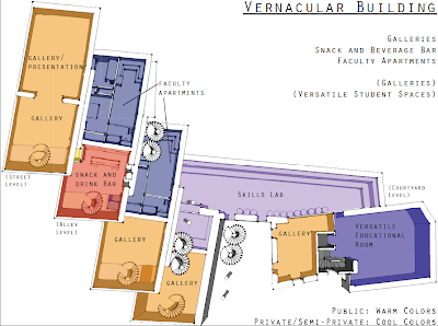

Faculty apartments are located in the Vernacular Building and accessible via a tiny alley that runs between the Vernacular and Liberty buildings, giving resident faculty and their families the most private entrance on site. Their apartments are arranged in such a way that the bedrooms are on the far left in this image, which happens to be below street level and is therefore very quiet. The rest of the Vernacular Building is reserved for public uses. Galleries centered around a snack bar create the central area for public displays outside of the Rivellino.


(This slide gives an overview of the layout of the Liberty Building.)

Student housing takes up the top three stories of the Liberty Building. When asked about summer heat and winter cold, current residents have no problems with the exception of those living on the top story. These people suffer in the summer heat. Therefore, this design moves the main living spaces below the top story, which is reserved for all "wet" living needs. Laundry, showers, toilets, and vanity space for fifty students take up this top story.

The floor below the wet floor is reserved for quiet, private living. Capsules such as those found in Japanese capsule hotels replace bunk beds, allowing extreme privacy in a group living situation as well as condensing sleeping space to one floor instead of two.

Below the sleeping floor is the community floor. Here, residents will find a large kitchen and a common room with enough seating for more than the 50 students. Also on this level, separated by a wall, is one of three design studios.

Sleeping capsules will be stacked three high, and due to the walls can be placed right next to each other (unlike bunk beds). This allows sleeping space to be greatly condensed. A small number of capsules will be made like the one pictured on the top right of the stack of six. These capsules allow claustrophobic individuals to sacrifice privacy and quietness for the sake of an open environment. The television included with this unit does not have speakers; only headphones will work, keeping the capsule's environment from infringing on the surrounding area.

Each capsule has a 4cm rim shelf. At the back of each hangs a desk panel which will lift flush with the rim shelf to create a temporary private workspace. Light switches located by the door and above the desk control the overhead lighting system. A second switch above the desk controls smaller lights above the desk itself to prevent annoying shadows from the main light system located behind the resident's head when seated at the desk. Television sets with their own DVD players rest in the top corners of each unit. These are placed by the door hinge on normal capsules, but are moved to the back corner on open units to prevent head injuries. Windows in the doors allow views, with curtains to maintain privacy.

There are two more floors between the three student hosing floors and the combined courtyard level. The floor directly below housing is actually at street level on the non-courtyard side of the building due to the steep slope of the site. On this floor are the only two public spaces above the courtyard level. One is a cafe, with a street entrance, and the other is a student shop, also with a street entrance. This shop is meant to be used to sell student-made products, such as those derived from the skills lab. The culinary classroom is on this floor due to convenience of proximity to the cafe.

Below this floor, and directly above the courtyard level, is the rest of the studio space. Two more studios provide the rest of the workspaces needed for all 50 students. A small room with steps becomes a discussion/presentation/crit room. The steps allow students to sit and see over one another, or else a speaker to be above the group.

Workspaces are made of wood, as were da Vinci's devices, and suspended from the ceiling. Heights are adjustable to allow students to create their own personal perfect working environment. For the same reason, each comes with its own four adjustable lamps, controlled by four individual switches. Ten power outlets ensure that no student will be unable to work due to a lack of outlet availability (yes, this was a huge issue at the ostello, and all we had to plug in were laptops, unlike a normal studio situation which includes glue guns and other equipment).

Vertical circulation outside of the Vernacular building is provided by spiral people movers. Each floor has its own pair. The steps rotate up one column, move through the floor, rotate down the next column, then move through the floor to the first column. These are, essentially, spiral escalators. This enticing form of transportation is also the main way to get in to the galleries in the Vernacular Building. They take visitors up to the juice bar, through which they can access the galleries.

On the wall of the Liberty Building facing the Vernacular Building, there is a pole system meant to increase the versatility of display options. Threaded bases between floors accept caps or poles as needed. Poles have threaded posts on one end, threaded holes on the other. This allows multiple poles to be attached, or caps to be placed on the ends. These poles are made of metal for strength but are encased in wood in honor of da Vinci's creations. Each one has several hatches which allow access to metal ringlets anchored into the hollow metal pole interior. In this way poles can be used for hanging sculptures, paintings, performers, or anything else. There are two types of caps in this system; those with holes and those without. Holed capes allow the producer of any exhibition or event to pipe something through the cap, such as aromas produced in the skills lab, confetti, or anything else.

(Sorry for the lack of context - this presentation will be happening within the Rivellino and I didn't want to be redundant.)

This anchor ring system is designed to provide a versatile but non-invasive infrastructure for the Rivellino. Rings are approximately 10cm across and anchored periodically along the ceiling near the walls. These allow almost anything to be hung from them, be it lighting, a system for hanging paintings, or something else. Anything attached is easily removed, and in this way the Rivellino can undergo vast changes which are easily "reset."

One of the problems with the Rivellino is that walking in it means walking across dirt and mud, and it is very uneven and potentially dangerous. To mitigate this, the client has a plywood catwalk in part of it, and they wanted to put in more. Musicians who put on concerts there, however, are greatly opposed to this because the earthen floor and stone walls have perfect acoustics. The system I propose, therefore, is essentially a compact-dirt raised sandbox system. Earth from the Rivellino itself (which we cannot remove thanks to the City) will be packed into raised platforms. This retains both the flatness and control of the catwalk and the acoustics of the earth.

(Context: This is part of the Rivellino. Where the wood risers are shown, there is currently a ladder in order for people to descend the approximate two meters to that level, and another taller ladder to descend to the next level which is labeled as "Stage" and "Staging Area.")

This design takes a currently unusable space and gives it a purpose that meets the client's needs. Risers are designed to allow level entry from the corridor. The space below becomes the stage. The fact that visitors are looking down a cliff edge means that the foreground of the stage is not visible to most of the audience, making it the perfect pit area.

(Views of the theater.)

The overhead beam in the top left picture is already existing. It is in the perfect location for the anchor ring system to allow for temporary additions of curtains, lighting, or any other equipment that might be desired.

As you can see from the bottom two pictures, entry from the corridor is indeed level. No more dangerous ladders!

Wednesday, July 28, 2010

Finishing up the Liberty Building

The modeling process is going slower than I had anticipated. The floor plans aren't all the same after all, and some of them (especially the roof plan) are lacking dimensions. The plans I'm working from aren't printed to scale and don't have a graphic scale printed on them, so I can't accurately measure anything from the drawings.

In order to model the building, I must first draw each of the floor plans digitally. This gives me a basis to work from. I can extrude (extend into the third dimension) any face on a floor plan, thereby giving heights to walls.

(one of the completed floor plans)

As I model each level of the building, I am able to stack the levels vertically to form the overall building. This gives me the overall picture of what is going on, especially for the exterior.

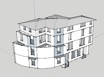
(top four stories of the six-story Liberty Building)

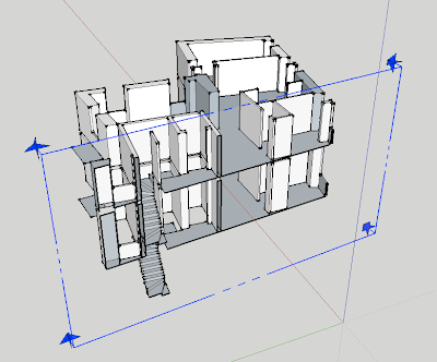
Now that I have a model, I can select portions of it to work with. I can move floors away from each other in order to focus my attention on one of them, or I can place a section through the building which will allow me to work on how the levels interact as opposed to looking at one level at a time.

(The blue frame is the section that I drew after separating out two stories of the building. The program shows only what is beyond the section frame, allowing me to cut a piece out of the model in order to work with it easier.)

Sunday, July 25, 2010

Understanding the Liberty Building

Before I can redesign a building, it is important that I understand what already exists, and why. It was easy to do this with the cavelike Rivellino, which is rather straightforward. It was also easy to do this with the more complex Vernacular Building, which is currently set up for a variety of purposes, most notably gallery space. This ease of understanding is a result of the drawings we were given and the fact that we were able to walk through these buildings on two separate occasions.

The Liberty building, however, is the most complex of the three structures and we weren't able to do a walk-through. People live in this building, so it is harder for us to tour. The drawings we were given are floor plans labeled in Italian and marked with dimensions in the metric system. It is a very confusing building for us to understand, and each group has its own way of figuring it out.

(floor plan of the fourth floor of the Liberty Building)

I have decided to do my analysis by making a digital model of the floor plans. This will give me a strong understanding of how the building functions and how the spaces relate to each other, while also providing a digital model for future use.

(the start of my model)

It turns out that the plans are really rather straightforward, and once I get one level complete, copying it will accurately produce most of the others. The finished model will allow me to cut a section through any part in order to understand it better, and I can move walls around to where I wish to place them in my new design.

Model making is always a rather brainless process, digital or not. I am using my spare brainpower to work on the exteriors while I model. This sort of semi-conscious design-while-producing-something-else method usually works very well for me. We'll see what sort of awesomeness my subconscious ends up randomly spitting out at me this time.

Saturday, July 24, 2010

The Fruits of Procrastination

Yesterday I had a one-on-one crit with my teacher, who says my work is solid so far and has clarified for me which part of my project I really need to work on most. It is refreshing to have a teacher who can easily verbalize what I need to work on.

Today I took the YouTube clip by Harry Potter Puppet Pals called "The Mysterious Ticking Noise" and made a new song based on the extended field trip. I recommend that you watch the clip before listening to the song if you've never seen it.

This link will take you to a site where you can listen to the song I made. Enjoy!

I have finished the design for the Rivellino, the cavelike fortress thought to have been designed by da Vinci. I am almost finished with the Vernacular Building (gallery spaces, faculty housing, etc.), which only leaves the Liberty Building (student housing, classrooms, cafe, etc.) and final production (making my presentation drawings and models). I have two weeks to finish all of this, so it is a very good thing I was working on it enough during the field trip to get all the massing figured out. Right now I am focusing on visual vocabulary, especially for the exterior facades. I will let function drive most of the interior vocabulary, but the outside can be almost anything and still be functional; I want to, for the first time, create a beautiful exterior facade. My designs are typically interior-oriented, creating pleasant, functional spaces inside a building with a rather boring exterior. It's time for me to do something with the outsides of my buildings.
(sketch drawing of the black box theater in the Rivellino)

The drawing above shows part of the catacombs in the Rivellino (ree-veh-lee-noh, stress the "ll"). The area in yellow is so far below the white corridor that there is currently a ladder in place for visitors who want to check it out. Another ladder allows visitors to move from the yellow space down to the pink/read/green/blue level. My design as shown here puts risers in the yellow space so people will walk straight onto the middle of the risers and will take steps up or down. The pink/red area below becomes a stage, and the green/blue space becomes the staging area. In this way, a previously unusable area becomes the black box theater the clients asked for, which frees up square footage in another building to add a small culinary school to my proposal.